















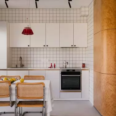

Can an interior still look just as good five years after it was designed? Magda Kwoczka’s project at Finch Studio shows that it can! This apartment wasn’t designed around a specific trend. It’s built on the principles of modernism: functionality, simplicity of form, respect for materials, and a thoughtful use of proportions. The contemporary interior draws on these principles without copying them verbatim, so it doesn’t resemble a stylization of a specific era but remains timeless regardless of changing trends.
Minimalism as a backdrop
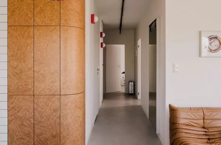
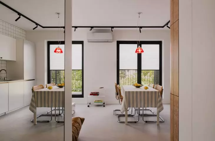
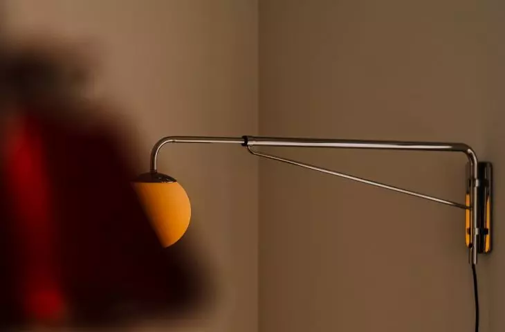
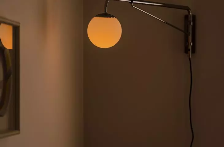
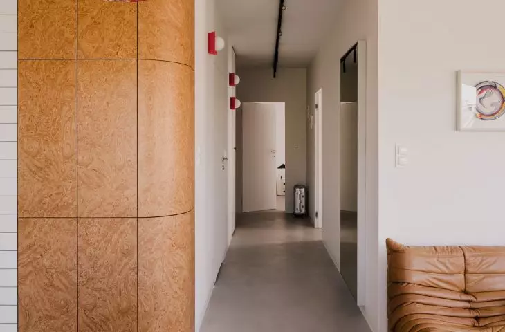
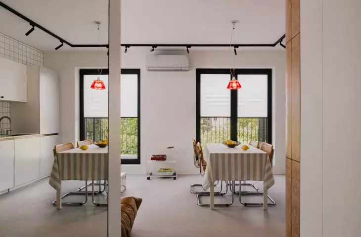
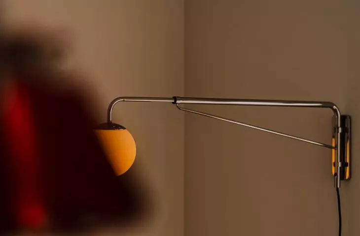
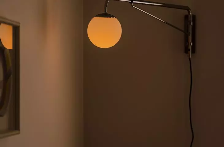
The project began with a meeting with the clients and the inspirations they had gathered. The photos, clippings, and objects that appeared in their ideas quickly set the direction for the design. Modernism became the point of reference—its functionality, simplicity, and commitment to materials. However, the interior does not attempt to replicate modernism in a literal sense. Instead, it draws on its fundamental principles. The forms are simple, the built-in elements are tailored to their function, and the materials create a calm foundation for more expressive furnishings. Concrete flooring is featured throughout most of the apartment . Its uniform surface organizes the space and allows the furniture and accessories to stand out more prominently. The white walls and built-in units are complemented by industrial-style light fixtures, which give the interior a slightly industrial character. Minimalism, however, is not an end in itself here. Rather, it serves as a backdrop for objects that introduce color, texture, and individuality.
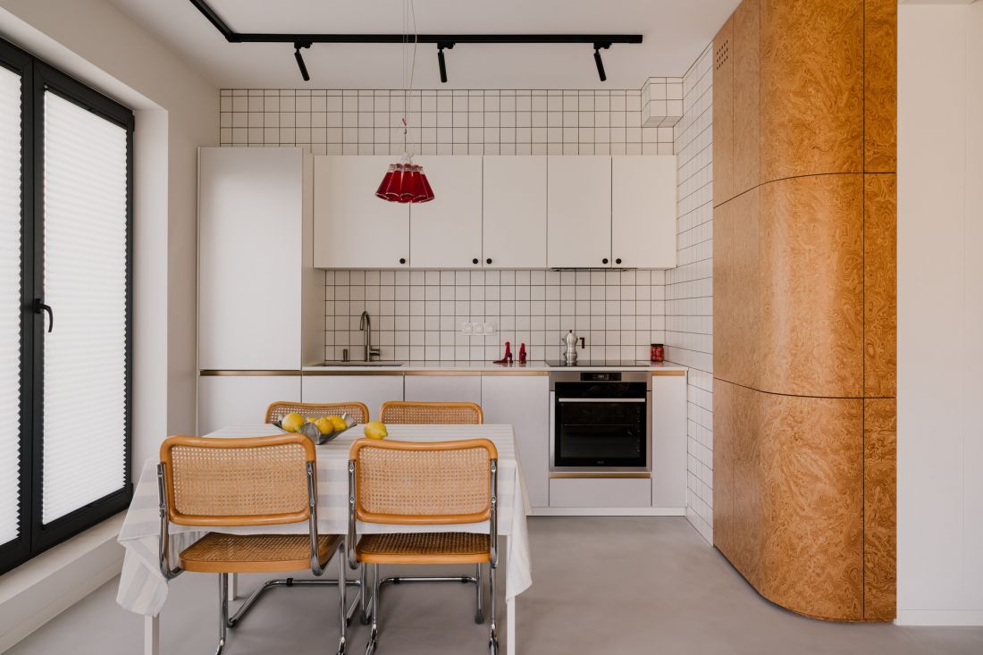
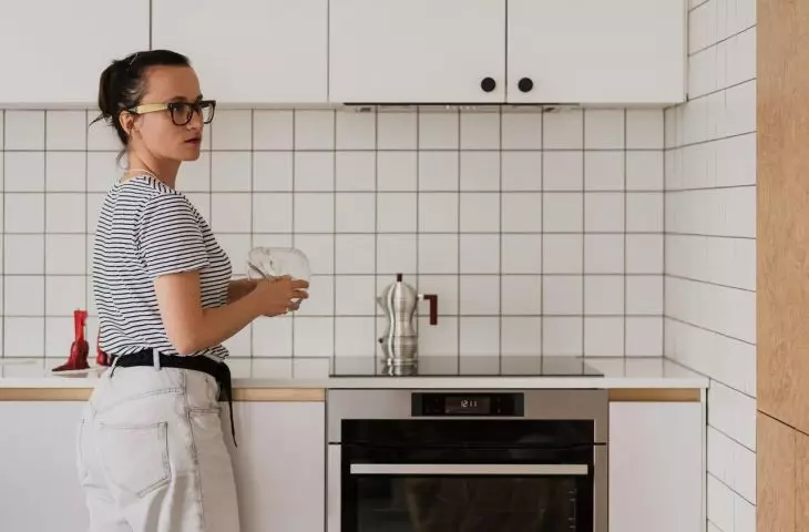
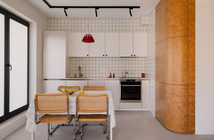
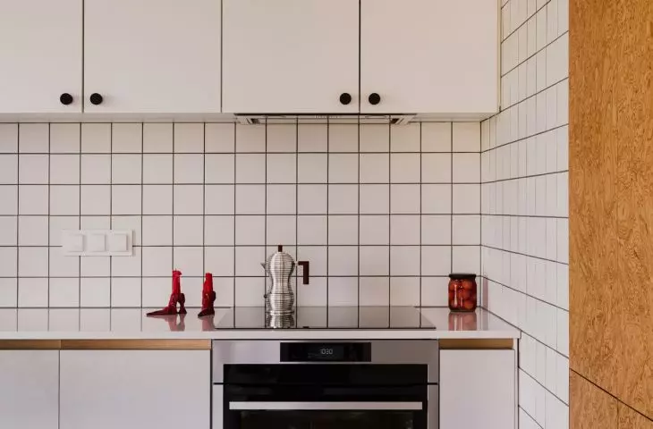
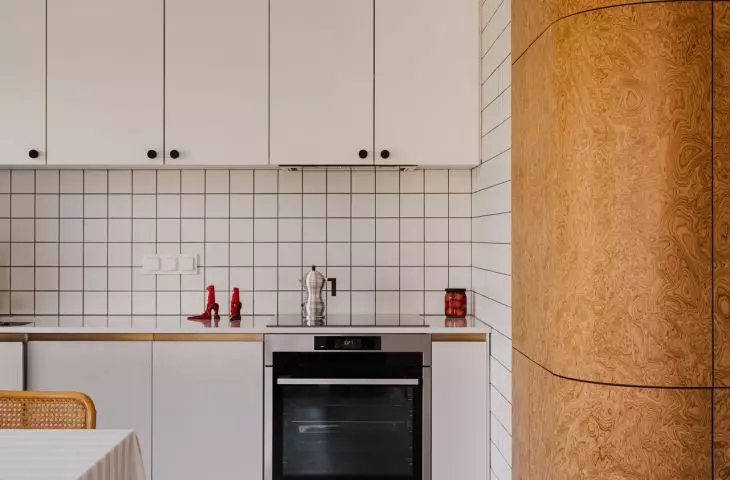
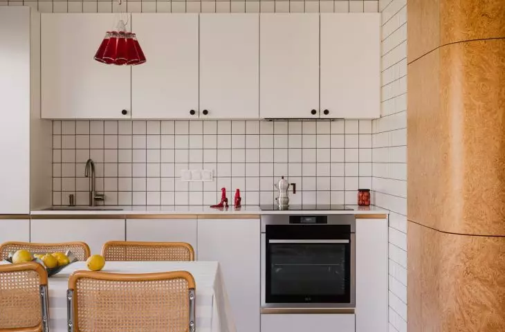
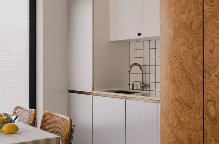
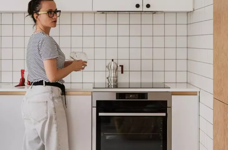
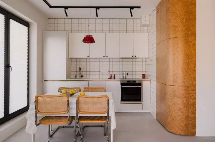
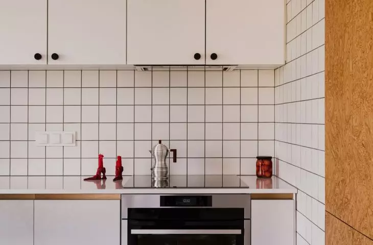
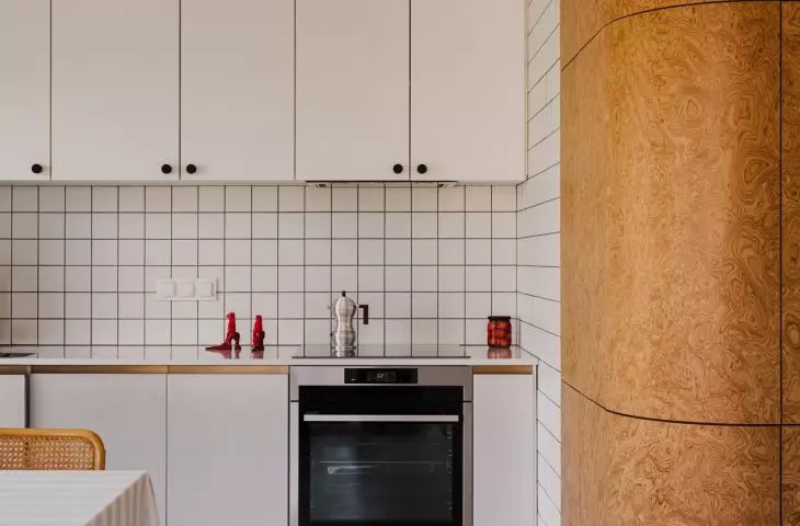
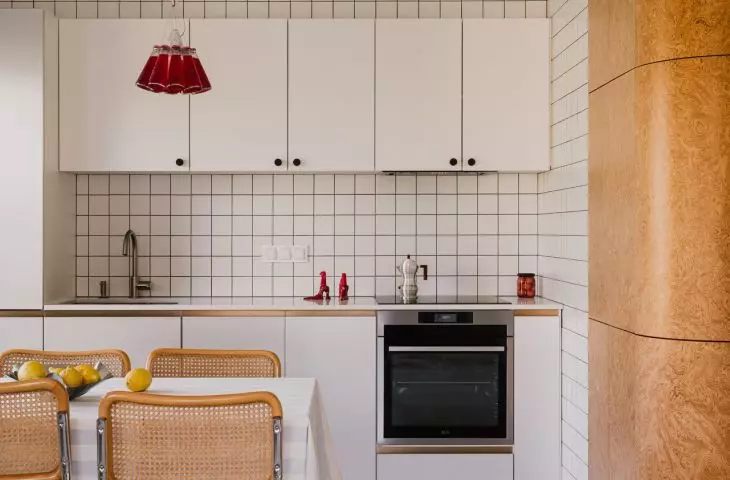
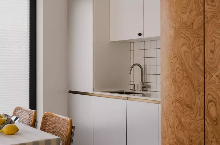
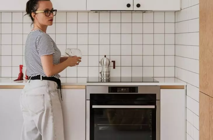
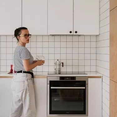
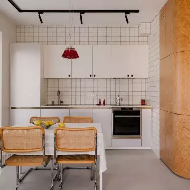
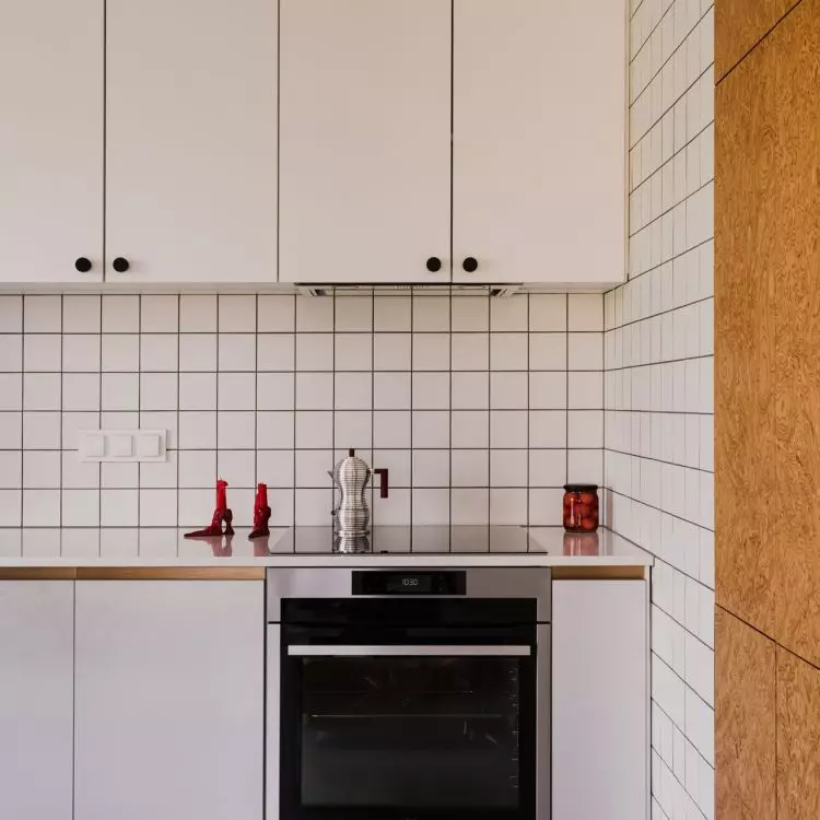
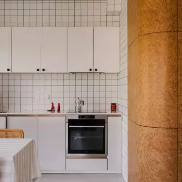
A kitchen with a very simple form and a modernist feel.
Photo: Studio Archives
Checkered Kitchen
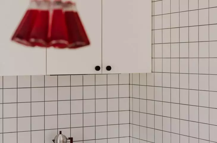
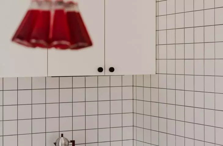
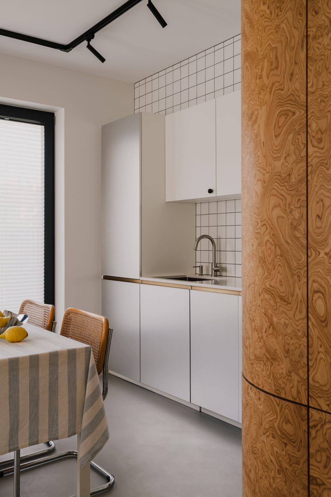
The cabinetry is inspired by Margarete Schütte-Lihotzky’s Frankfurt kitchen. Designed in 1926 by the Austrian architect Margarete Schütte-Lihotzky, it was a groundbreaking kitchen — the first modular kitchen in history. The white cabinet fronts are paired with square tiles set with black grout. The regular grid resembles a technical drawing or a page from a checkered notebook. This graphic motif fits well with the modernist character of the interior and evokes associations with Gdynia modernism, which the designer greatly values. One element of the cabinetry is a tall, rounded unit finished with wood veneer. Its soft form breaks up the geometric order of the tiles, and the distinctive grain of the veneer becomes a decoration in its own right. It is precisely this combination of simple white surfaces with natural, richly grained wood that gives the kitchen its distinct character. Lightweight chairs with chrome tubular legs and woven seats and backs are placed around the table. Their form harmonizes well with the room’s modernist character while also introducing a sense of softness through the materials.
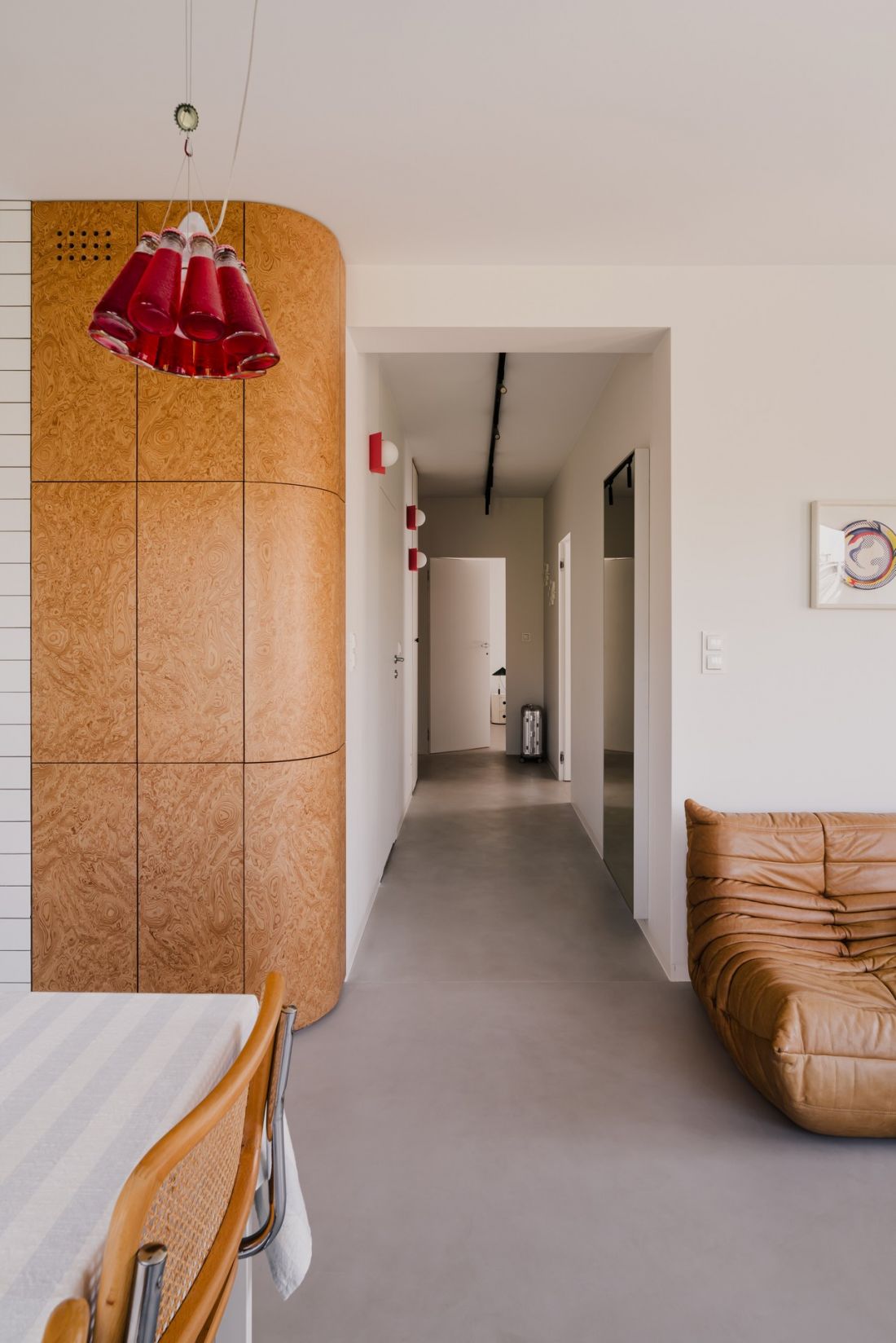
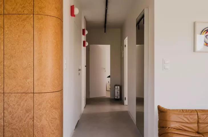
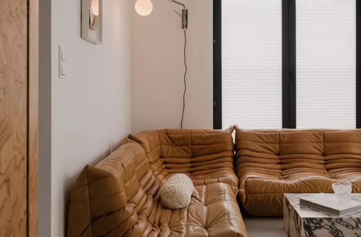
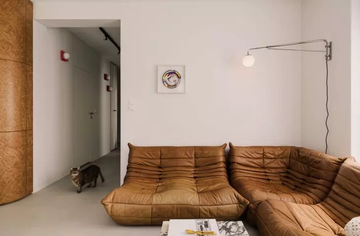
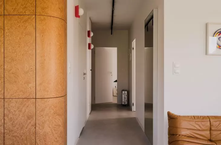
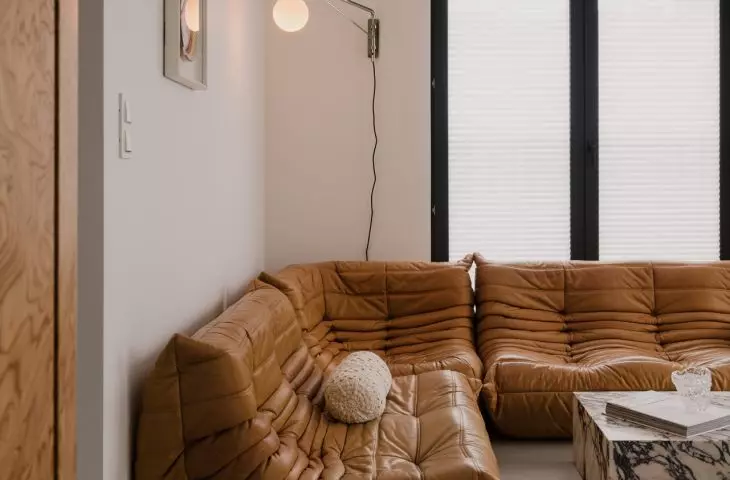
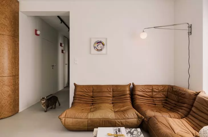
The wooden cabinetry and caramel-colored sofa add warmth to the gray floors and walls.
Photo: Studio Archives
Subtle Accents Instead of Decorations
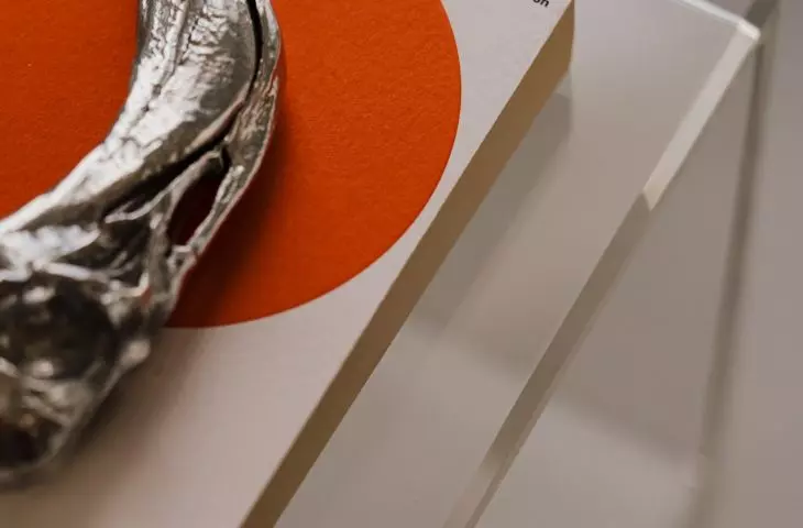
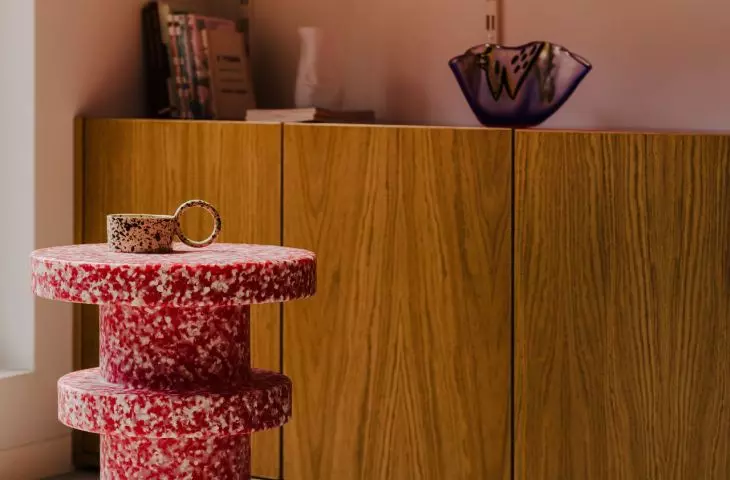
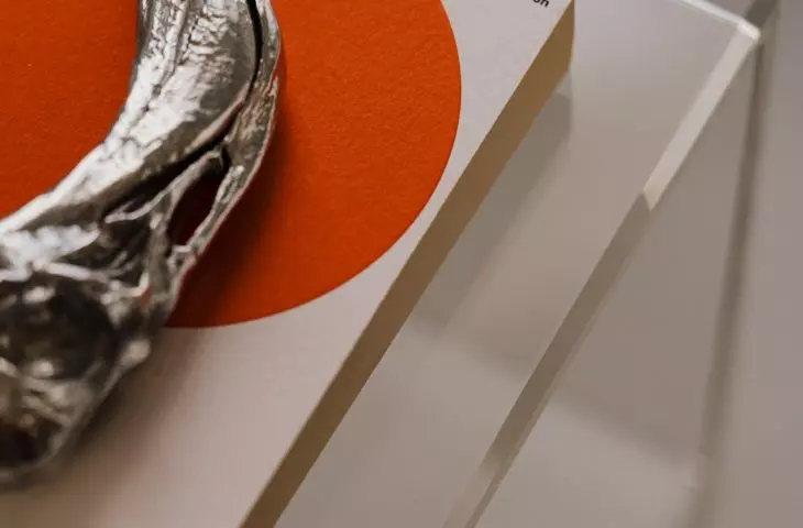
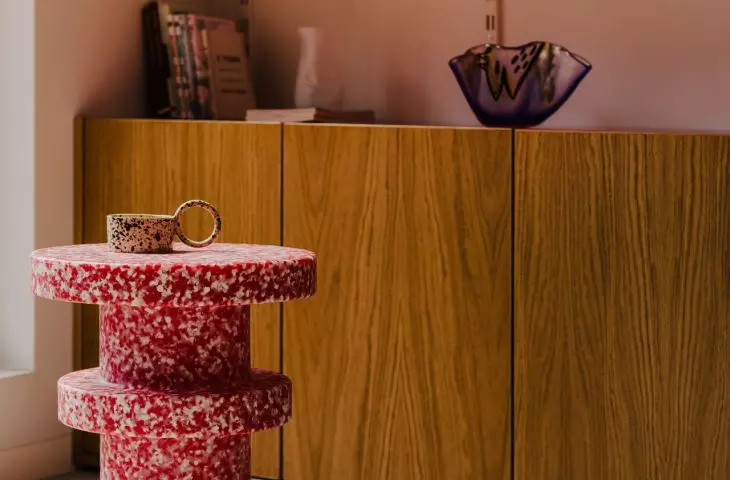
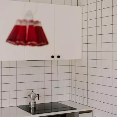
In this interior, decorative appeal doesn’t come from an accumulation of ornaments. Instead, individual items have a strong form or color, allowing them to function almost like sculptures. A good example is the red lamp made from bottles in the kitchen, which stands out sharply against the background—the intense red in the bright kitchen immediately catches the eye. Small accessories placed on countertops or shelves serve a similar purpose. Red shoe-shaped figurines, a spiral-shaped metal object, or small ceramic pieces do not form a classic decorative arrangement. Rather, they are individual focal points that break up the white.
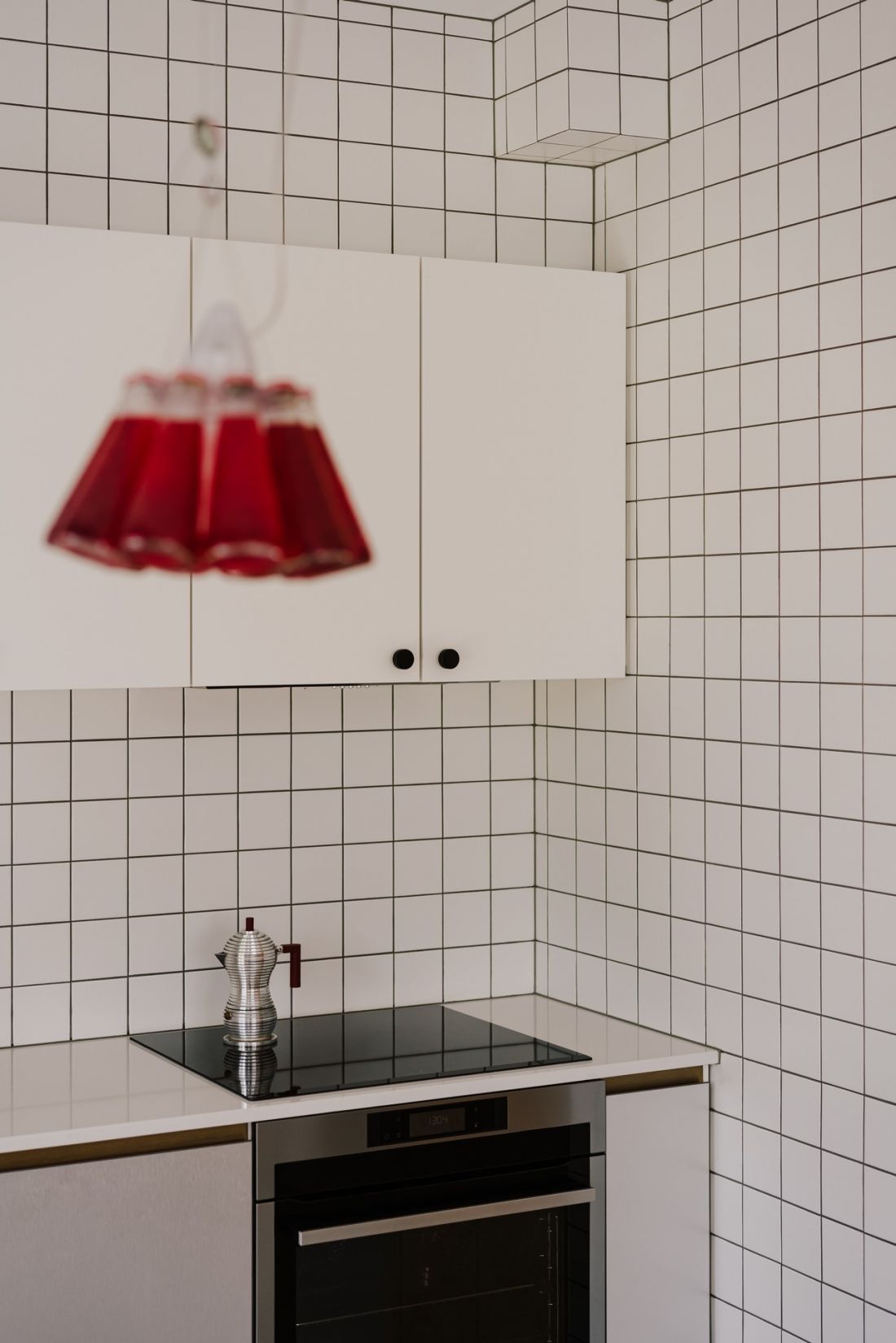

The lamp made from bottles is a truly surprising element of the interior.
Photo: Studio Archives
Caramel-colored Togo sofas and marble
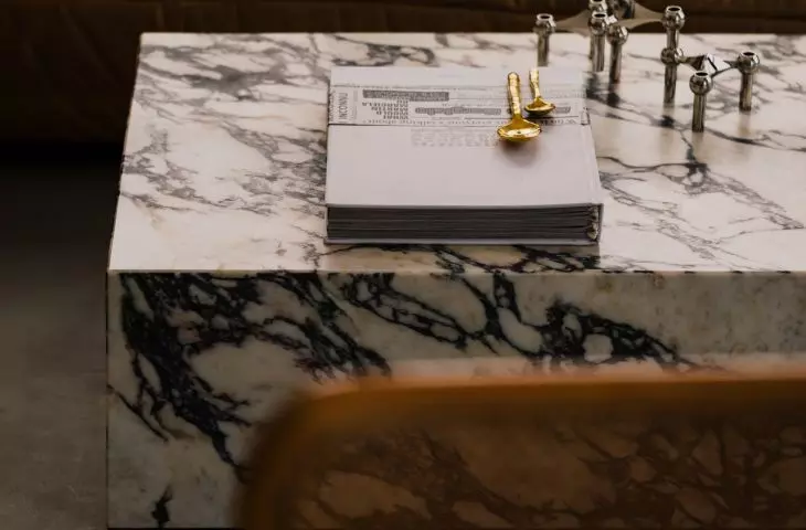
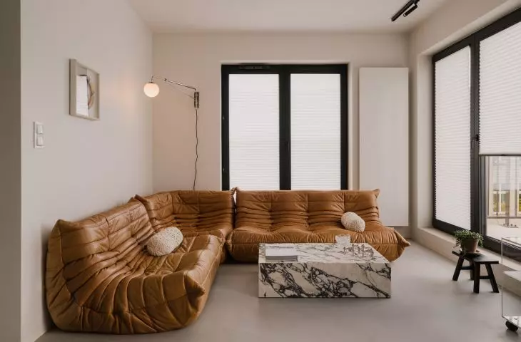
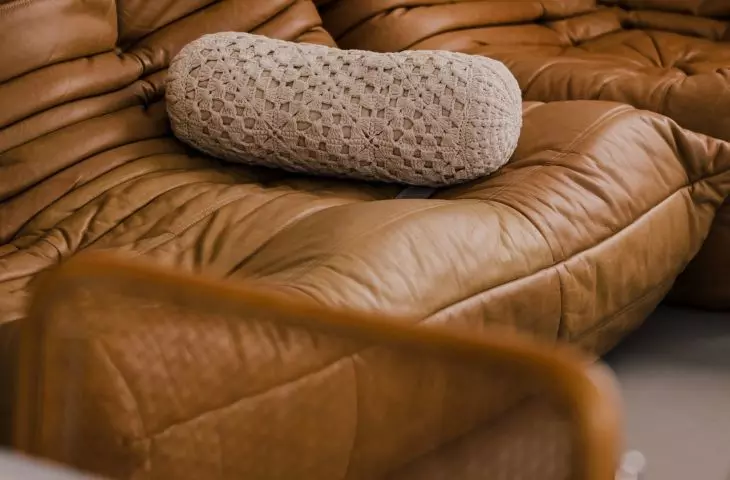
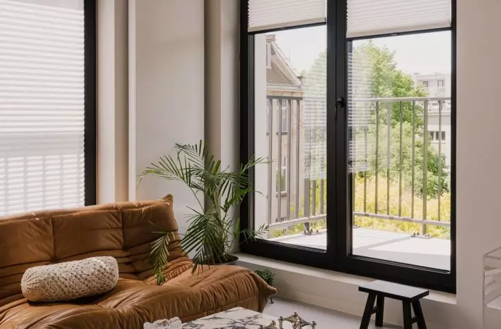
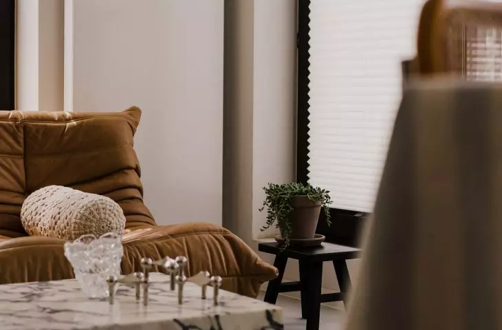
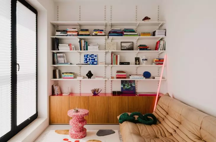
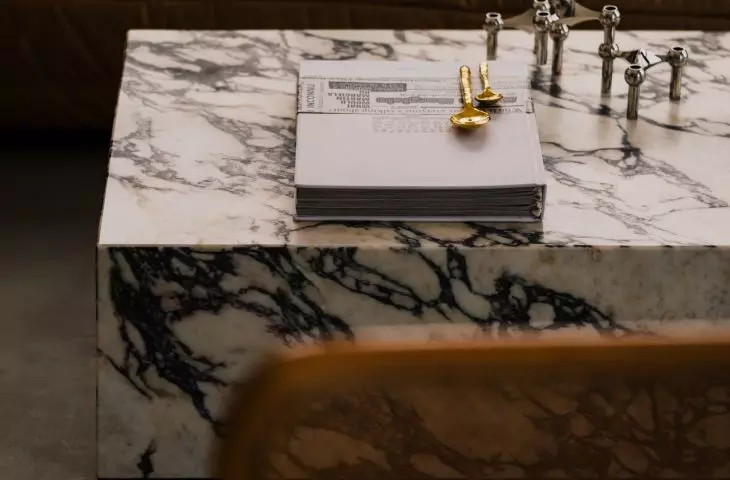
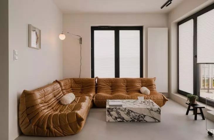
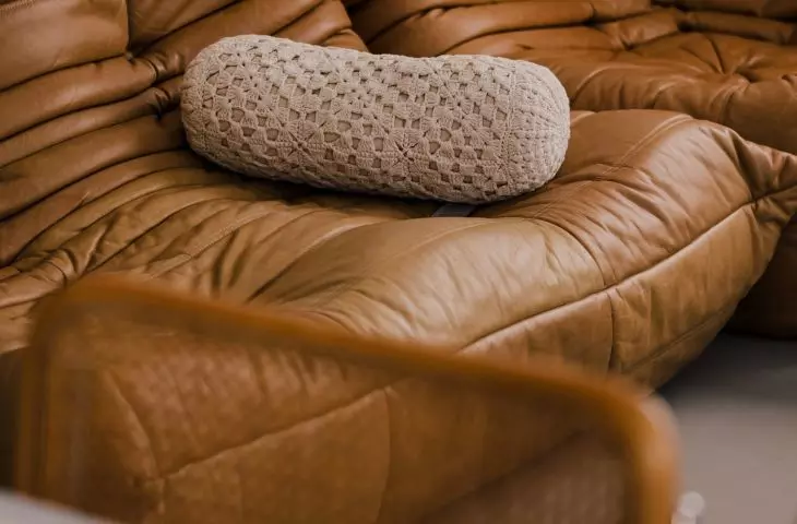
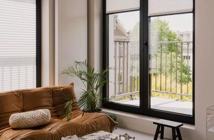
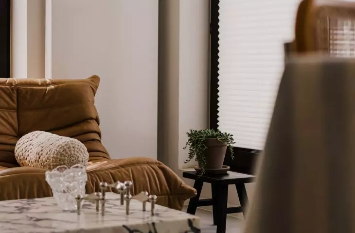
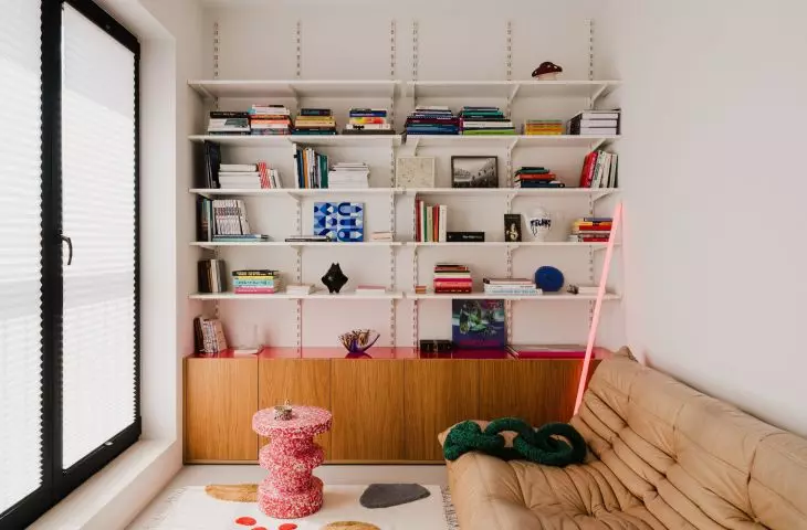
The living room is built around a few very distinctive elements. The iconic caramel-colored Togo sofas make an appearance . Their soft, low profile contrasts with the simplicity of the other furnishings. The distinctive quilting and soft curves of the leather introduce a completely different scale and texture to the interior than the smooth concrete floor or white walls. Opposite the sofa stands a massive coffee table with a stone top and sides. Its heavy, monolithic form balances the softness of the Togo. This juxtaposition of two extremely different objects—a soft piece of furniture and a heavy stone block—defines the character of the lounge area.
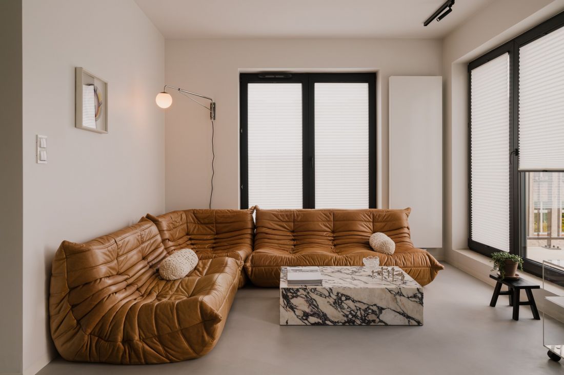
Togo sofas with low backrests and a low, cuboid coffee table.
Photo: Studio Archives
This bookcase has an industrial feel to it
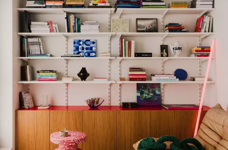
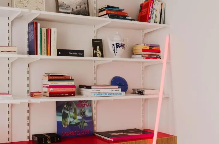
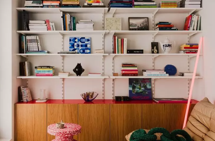
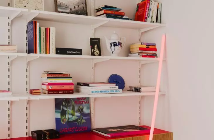
Another distinctive element of the apartment is the bookcase. Its design has been kept minimal —white, vertical profiles, somewhat industrial in character, and thin shelves create a light, almost “levitating” structure. As a result, the wall isn’t dominated by a heavy piece of furniture. Instead, it serves as a backdrop for a collection of books, prints, and objects. The shelves can be seen as additional horizontal lines that organize the interior, while the objects placed on them add a splash of color. Below the shelves is a wooden base unit with simple fronts. Its warm hue balances the white of the structure and the concrete floor.
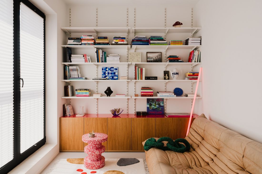
The shelves of the bookcase give the impression of floating.
Photo: Studio Archives
A bedroom without unnecessary elements
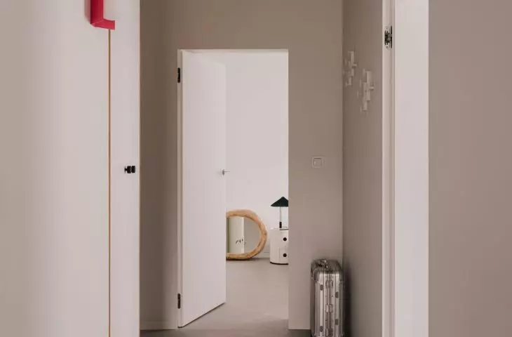
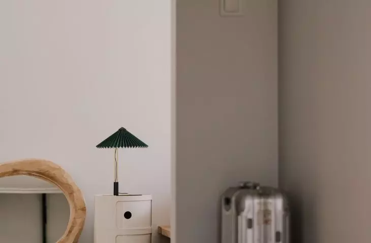
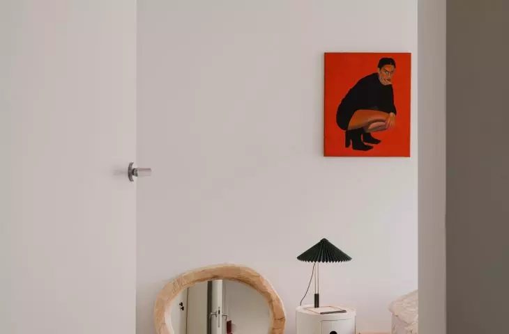
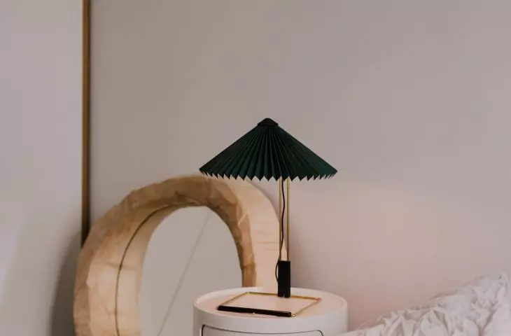
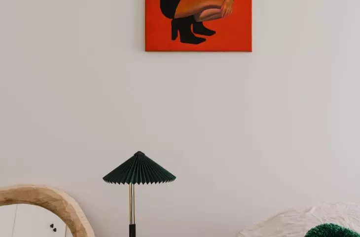
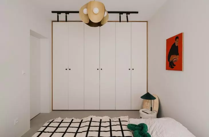
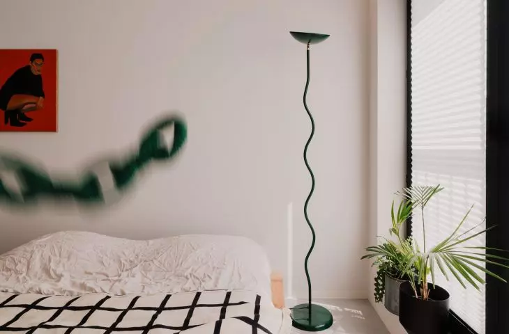
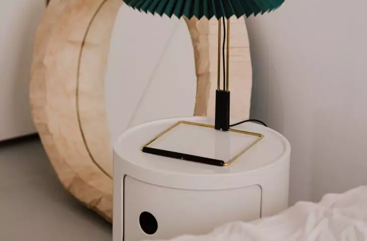
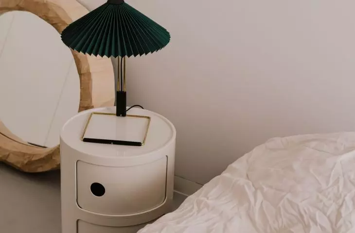
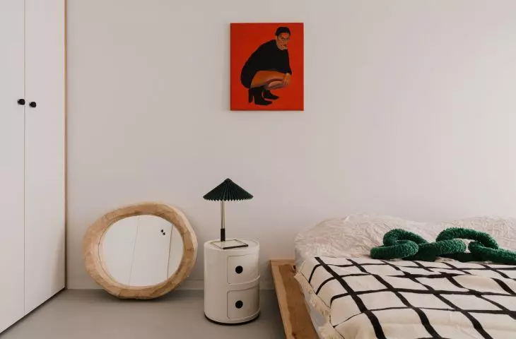
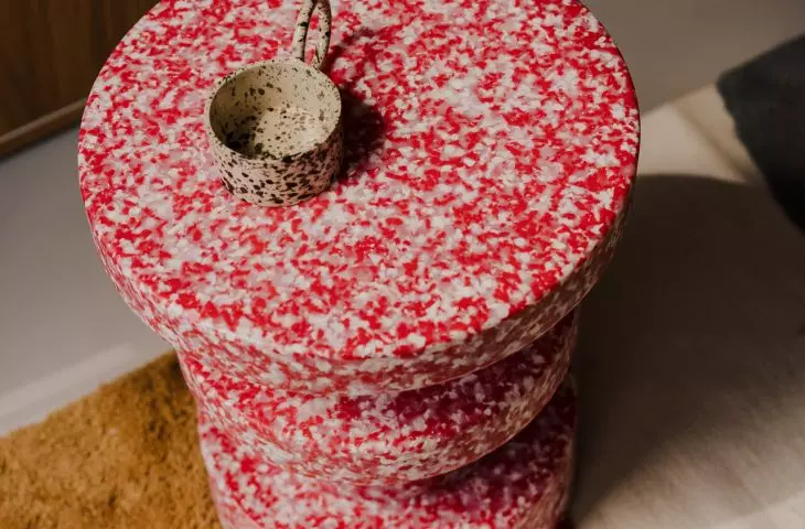
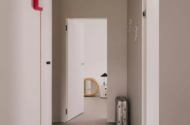
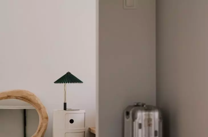
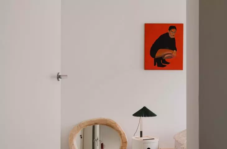
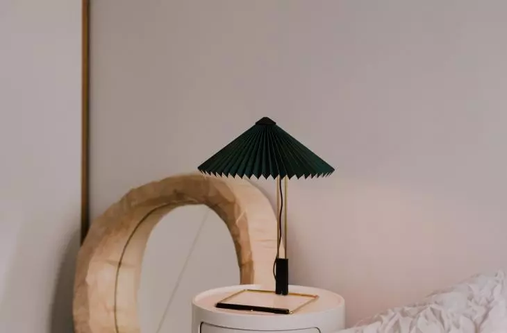
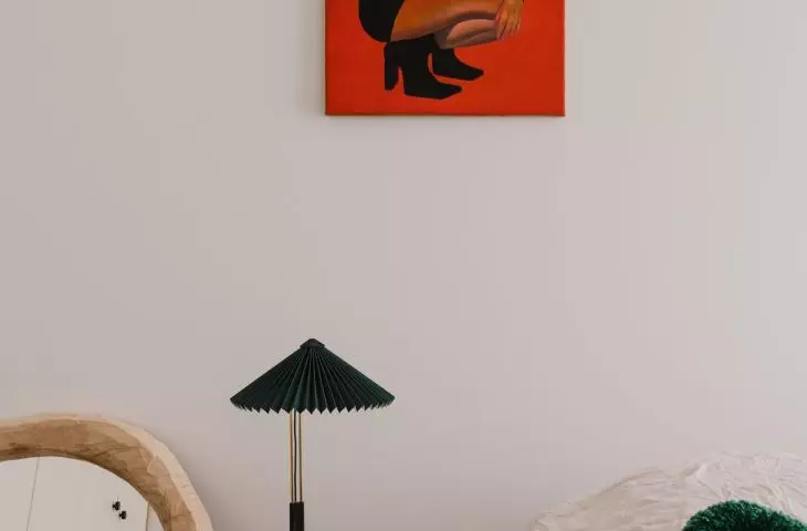
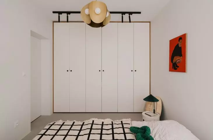
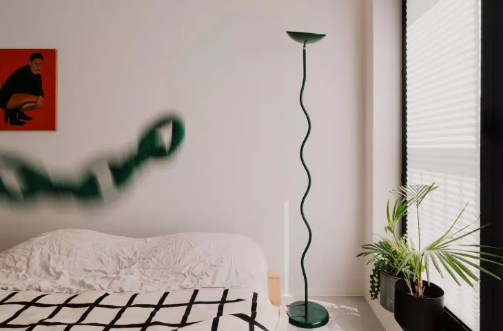
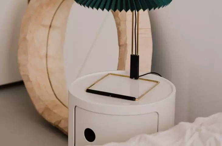
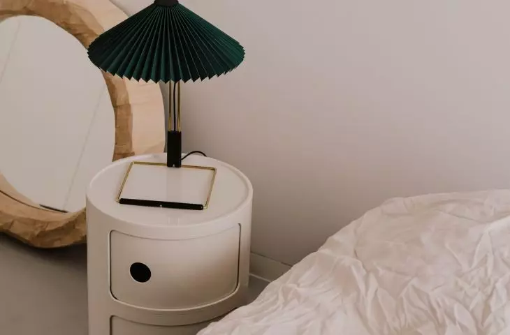
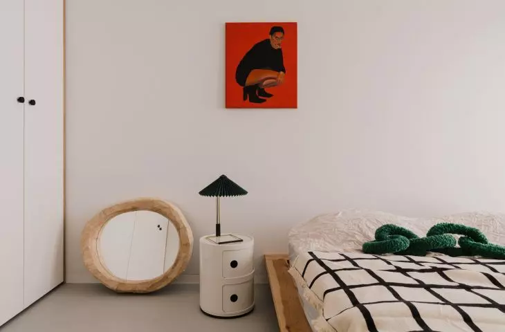
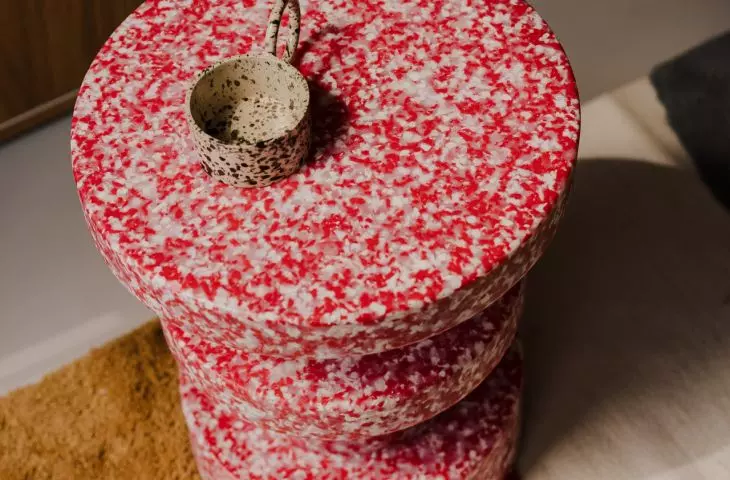
Here, the designer deliberately limited the number of elements, leaving more empty space. White walls, a simple bed, and a calm color palette create an interior that serves as a sanctuary. The architect applied the principle of subtraction to allow individual details to stand out, such as the brass sheet ceiling lamp, manufactured by the “Lumet” Workers’ Cooperative in Poznań. Next to the bed stands a classic, white Kartell side table with a rounded shape. Nearby stands a large mirror in an irregular wooden frame. Its organic form contrasts with the simple built-in furniture and the geometric character of the rest of the apartment. A vivid red painting hangs above the bed. It is precisely these individual accents that prevent the minimalist bedroom from feeling anonymous.
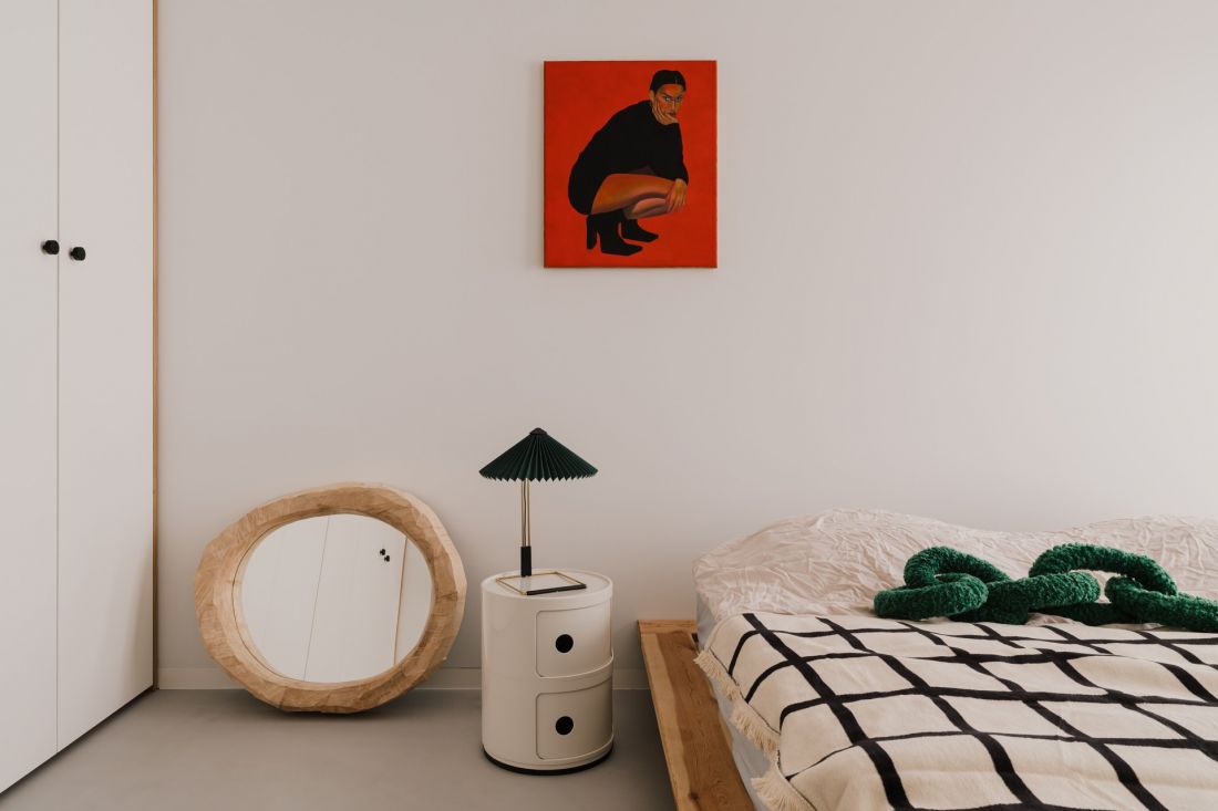

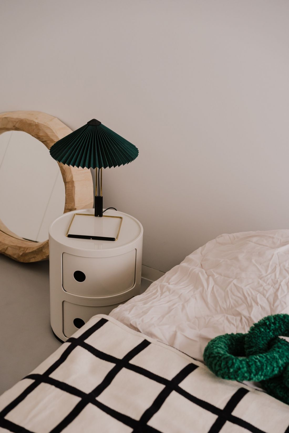
Thanks to bold accessories, this simple bedroom takes on a distinctive character.
Photo: Studio Archives
Bathroom—another “checkered page” in this apartment’s notebook
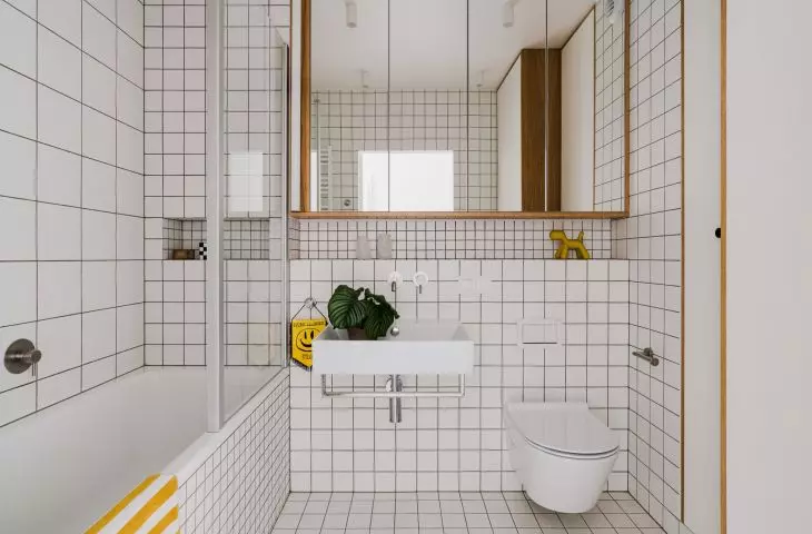
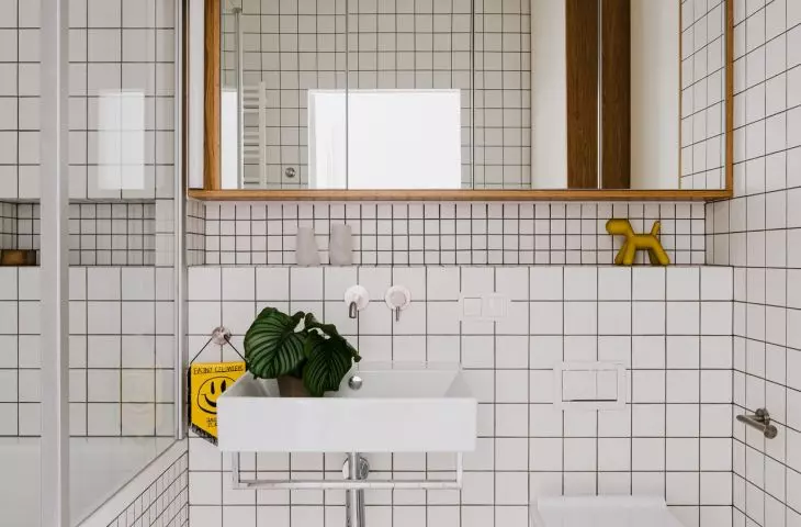
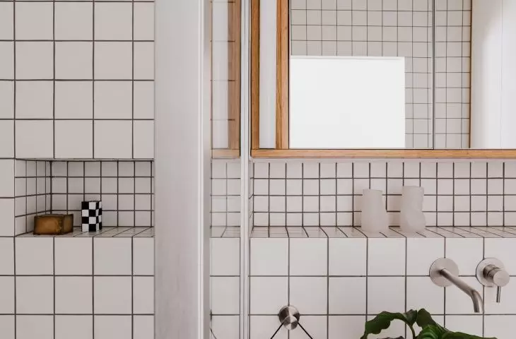
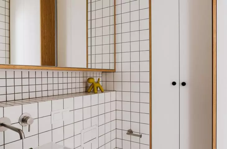
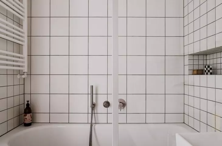
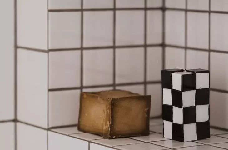
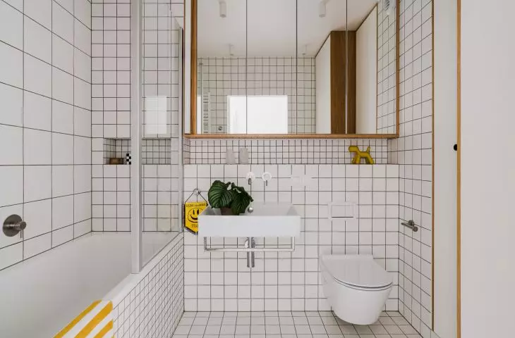
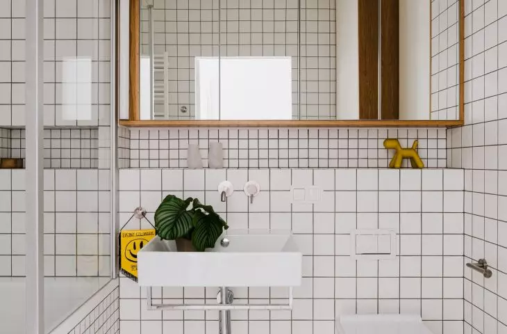
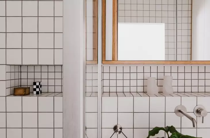
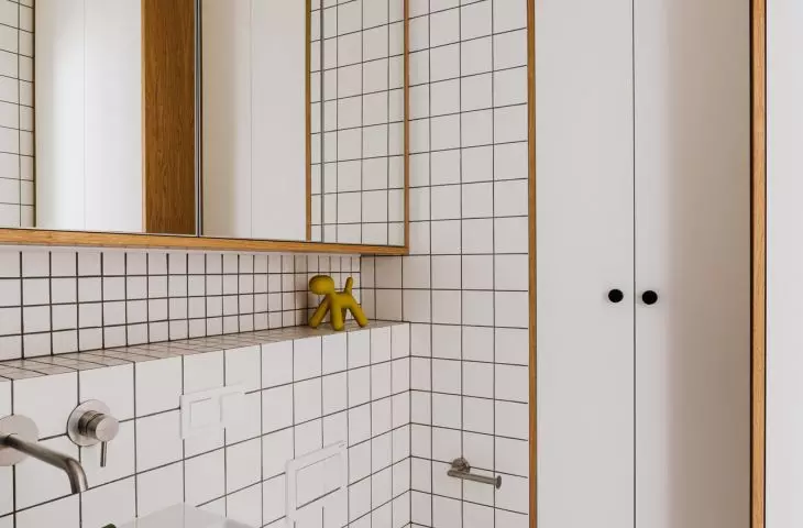
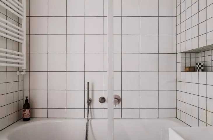
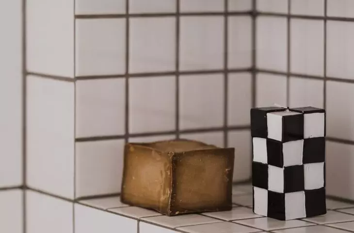
The bathroom strongly echoes the kitchen. White square tiles with dark grout cover both the walls and the floor, creating a distinct rhythm. The geometric pattern is broken up by wooden details. The large mirror features a simple wooden frame, and the cabinet fronts are also finished in wood. Thanks to this, the room isn’t merely a black-and-white arrangement of lines. The necessary functional elements have been successfully concealed within the built-in cabinets, preserving the clean composition. The sink has a simple, almost architectural form, and the concealed faucets further minimize the number of visible elements.
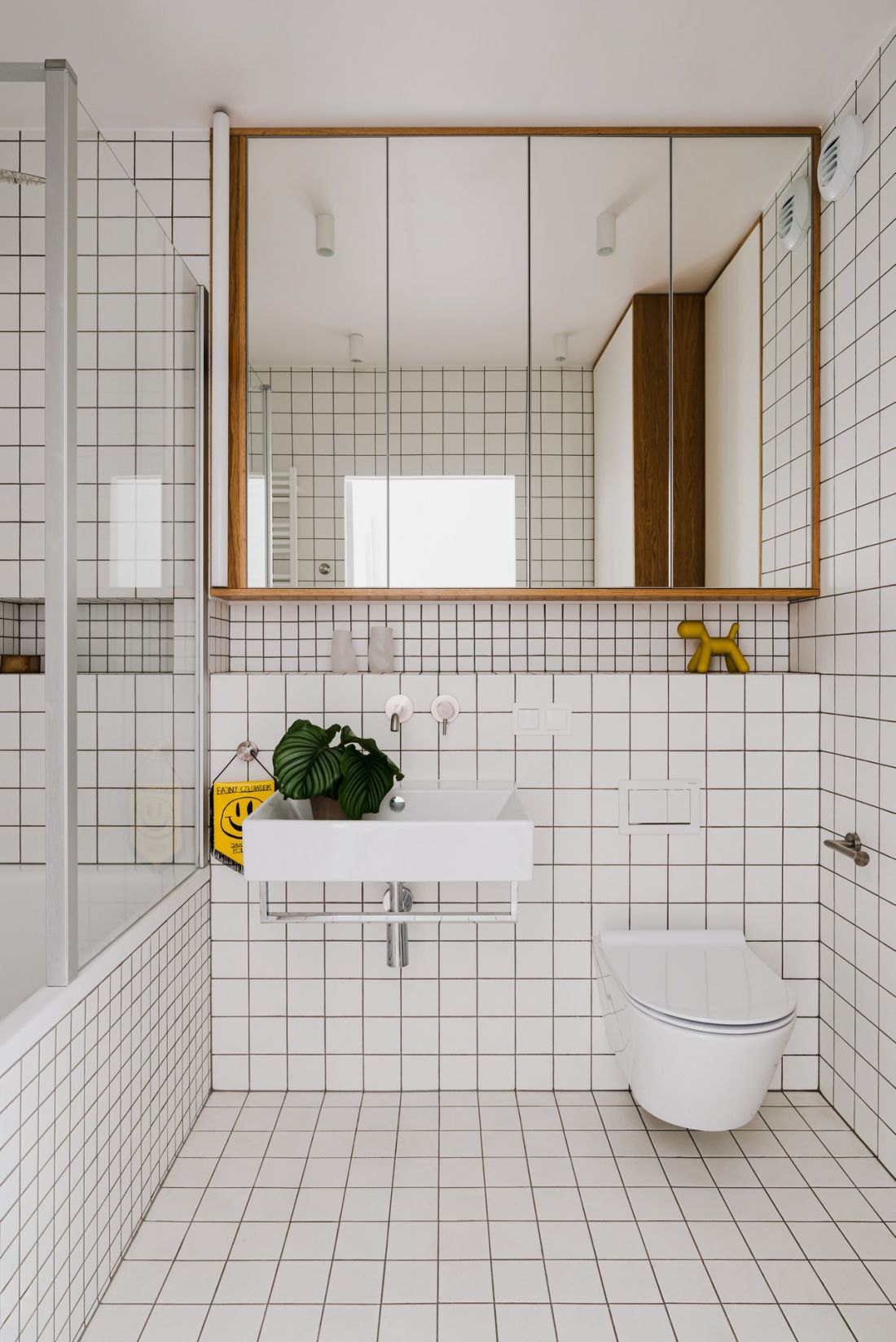
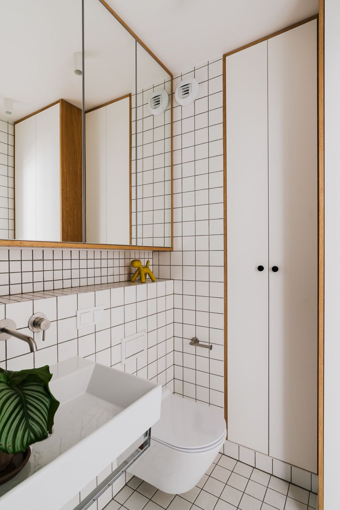
This highly geometric bathroom is designed in the same style as the kitchen.
Photo: Studio Archives
design that needs no introduction
The apartment is an example of an interior where minimalism does not mean emptiness. On the contrary— the simpler the base, the more clearly individual objects stand out. The design remains open to change—it can evolve and grow alongside its residents. Five years later, it has not lost its relevance; on the contrary—it has gained even more value over time. The designer admits that this is precisely because it was not designed from the outset to fit a specific “style.” The goal was not to create an interior that would meet a specific set of aesthetic criteria, but rather a space that emerged from the people, their daily lives, and the objects that matter to them. The style emerged, so to speak, as a natural consequence of these choices—not as an end in itself.